Planet Photoshop
The Evolution of 3D Text in Photoshop
I’ve been a designer for the better part of 20 years, and I’ve seen design trends come and go. Some have endured and many have faded into obscurity. As Photoshop has always been my tool of choice for almost every creative venture, there was one thing that seemed to always be missing when it came to designing with text in Photoshop—3D. Not just 3D text, but the ability to manipulate and render it to look as real as any other high-end 3D application. It seemed a natural fit for Photoshop.
Several years ago, Adobe had an interesting little application called Adobe Dimensions. This standalone program was limited yet powerful, as it could create 3D PostScript vector art, which could be imported into Illustrator or Photoshop to create interesting 3D effects. It was limited because you could only create basic shapes or do simple extruding or revolving. At the time, it was the best option among a few cheap plug-ins that also faked 3D in various ways. After having minimal success with that program, Adobe decided to discontinue it, even though it was the only 3D offering Adobe had at the time.
Not too long after the demise of Dimensions, Adobe decided to roll some of its 3D features into Live Effect in Illustrator CS, essentially putting a scaled-down version of Dimensions in Illustrator. Though different in appearance, it had many of the same features that were available in Dimensions, and because it was originally a vector-based app, it seemed right at home in Illustrator. So I continued to use these tools to create numerous 3D concoctions including 3D text, which I would create in Illustrator and bring over to Photoshop as a vector smart object. Since Photoshop didn’t support 3D at the time, that was the only way to edit the angle of the 3D text by going back to the original file, making the changes in Illustrator, and then saving it back to Photoshop. It involved many more steps but it did work; however, I still had to fake the rendering and create the lighting and reflections myself—all this at a time when we had only a fraction of the computing power we have now. Growing pains indeed!
This example was done creating a simple text extrusion in Illustrator and then bringing it into Photoshop. As much as I like the final product, the workflow process was tedious.

THE DAWN OF A NEW AGE
One day while we were working in our offices here at the NAPP, we learned that there were 3D features coming to the next version of Photoshop, which was CS3 at the time. Later that year we attended a summit at the Adobe headquarters in San Jose, California. We met some of the Photoshop team and watched exclusive demos of the new Photoshop features, including 3D. We were excited to see these new features firsthand. Halfway through the demonstration, the wind was taken from my sails as I discovered the 3D features were only to support files that were created in other applications, such as Maya or 3ds Max. That was it. You could bring in 3D models and adjust mesh textures and some lighting, but it was still limited.
At the end of the demo, I asked if there were any future plans to allow the creation of 3D text in Photoshop, because at the time I was really inspired by the use of 3D text in movie posters such as Tomb Raider. This was a level of realism you just couldn’t fake, and I wanted to be able to do that in Photoshop. The engineer told me that 3D text wasn’t planned as of yet. Alas, my 3D aspirations would have to wait—at least until the next version.
3D—COULD IT BE?
When Adobe rolled out Photoshop CS4, it seemed that they were listening to designers, as we were given the ability to create primitive 3D shapes such as cubes, spheres, cones, etc. You could even place a flat 2D image in 3D space and generate accurate perspective. This was pretty cool and a step in the right direction; however, there were still no 3D type tools.
So you might be asking, “Well, Corey, why don’t you just do 3D type in another 3D program?” Much easier said than done. At the time, 3D software was still really expensive and was very hard and tedious to learn. All I wanted was the ability to create true 3D text in a familiar application and use the power of Photoshop to add realism. Learning a new 3D program seemed overkill for some 3D text. So my wait continued. This doesn’t mean I didn’t experiment with the new features in CS4, and I soon discovered some really interesting tricks, but we’ll get to that.
As the cycle continued, Adobe released Photoshop CS5. This version had quite a few enhancements to the 3D features in Photoshop, but they were now called Repoussé. Why? Probably because it sounded artsy and cool but all it did was confuse people. When you’re introducing 3D to designers, you need to be as straightforward as possible. When have you ever used repoussé in casual conversation? In case you’re curious, repoussé is the practice of creating relief sculptures in sheets of metal by hammering the metal into shape from the backside. Essentially, making 3D from 2D.
Though this nomenclature failed to catch on, these new features, however, did allow you to create 3D text in Photoshop, among other things. You could extrude text into a 3D object, which you would modify using the Repoussé panel. Finally, we could create 3D text in Photoshop! It wasn’t quite all the way there yet, but it was a huge stride forward. The fact that you couldn’t edit the text after the 3D conversion made you committed to whatever you were doing, so if you wanted to change the text, you had to start over again.
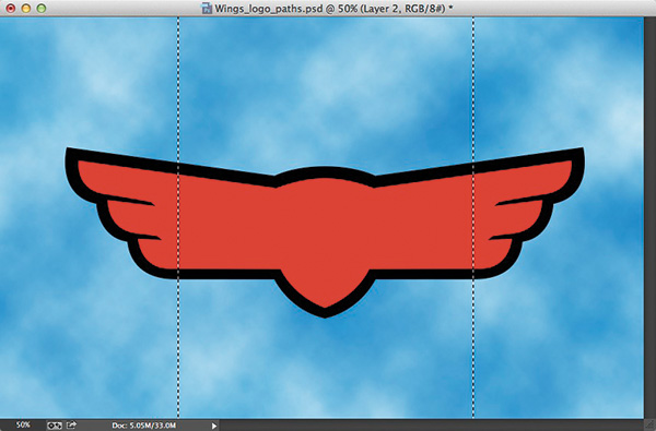
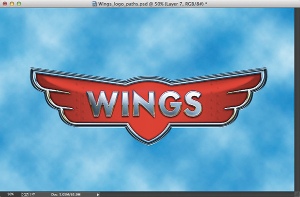
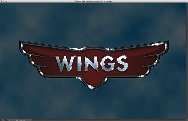
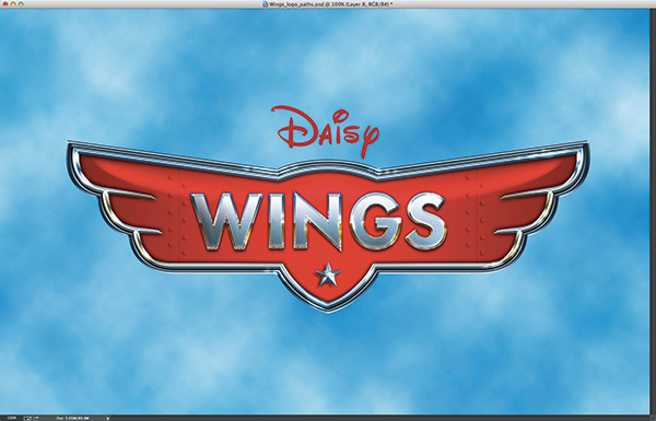
Since CS5 created really smooth 3D from vector paths, I started experimenting with different ways to create logo vector paths and then convert them to 3D in Photoshop. Here are a couple examples of 3D created in CS5. The artwork pretty much had to be fully realized before any 3D conversion could happen because once it was converted to 3D, there was no going back. In both examples, you can see the combination of 3D text and 3D elements to complete the overall look.
![]()
When CS6 was released, I did a dance of joy, as we now had the full capability to create, modify, and render 3D text, complete with accurate lighting, reflections, and shadow properties. Once I started experimenting with these features in CS6, I finally felt like designers could easily create 3D text in Photoshop and render it with realistic 3D properties. I was ready to see if I could achieve the same level of depth and realism those complex 3D programs could render.
THE TEXT OF A NEW GENERATION
The journey has been long but we have finally arrived at a place that allows us to create and modify 3D text. With most limitations now alleviated, we can push our creative ideas further than ever before with the assurance that we can improvise along the way and tweak it until it’s just right. Let’s create some 3D text so you can see how easy it is to get started.
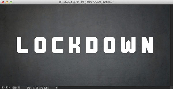
STEP ONE: Create a new document (File>New), switch to the Type tool (T), click in the document to set a text layer, and enter some simple text. As a rule, it’s a good idea to use thick, bold fonts as they show more volume in 3D. Once you have the text set, switch to the Move tool (V), press Command-A (PC: Ctrl-A) to select all, and click the Align Vertical Centers and Align Horizontal Centers icons in the Options Bar to center the text in the canvas area. Press Command-D (PC: Ctrl-D) to deselect.
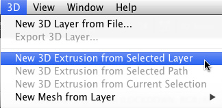
STEP TWO: Go to 3D>New 3D Extrusion from Selected Layer, and voilà, 3D text! It extrudes the text and applies a default light, which generates the shadow being cast on the ground plane.
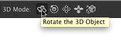
STEP THREE: With the Move tool selected, use the 3D tools located in the Options Bar (they’re the last five icons in the Options Bar). These allow you to manipulate the 3D object in 3D space. You can also use the axis widget, which appears over the object when the object is selected (click on the 3D object to select it). Simply hover your cursor over different areas of the widget, look for the tool tip for the property you want to change, and then click-and-drag.
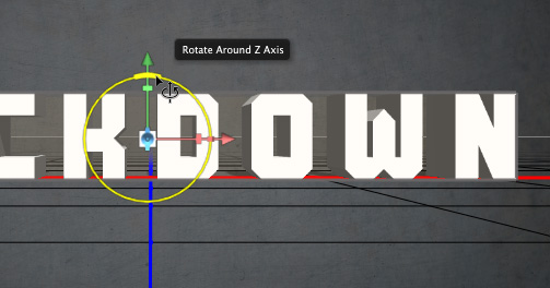
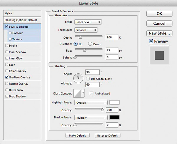
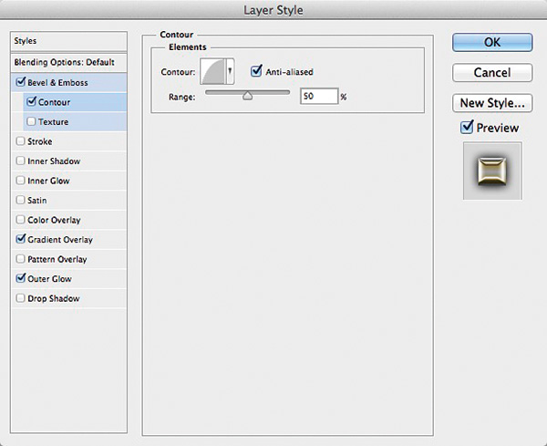
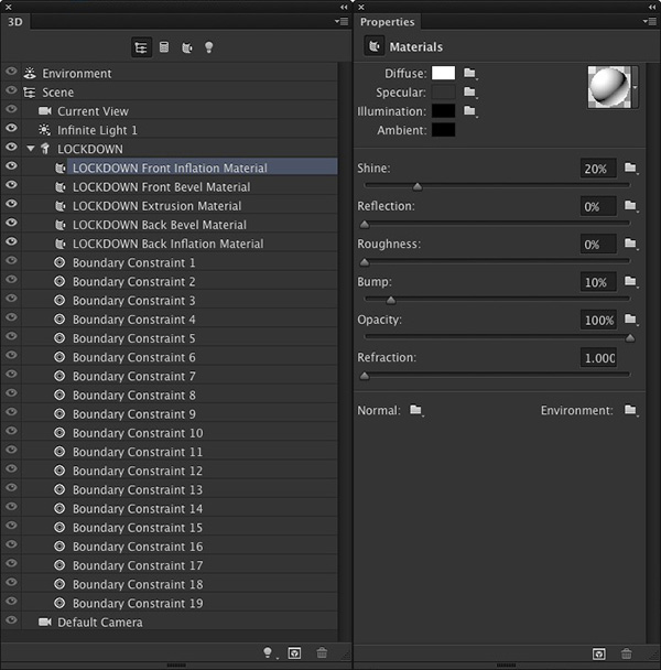
STEP FOUR: When editing 3D, there are two crucial panels you need to have open: the 3D panel and the Properties panel, both located under the Window menu. I like to dock these two panels next to each other because they work hand-in-hand. Select the property you want to modify in the 3D panel and then those settings will appear in the Properties panel.
STEP FIVE: You should see the 3D text line item in the 3D panel. Click on it and you’ll see some key settings in the Properties panel. In the lower area there are some text editing features. You can change the color and even modify the text formatting right from the Properties panel. You can also click on Edit Source and it will open the original file with the text layer. Simply change the text, close and save the document, and it will update the 3D text accordingly—all without having to start over. But wait, there’s more.
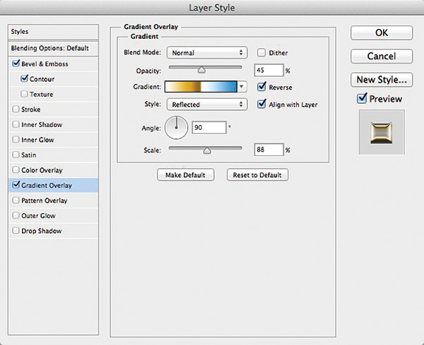
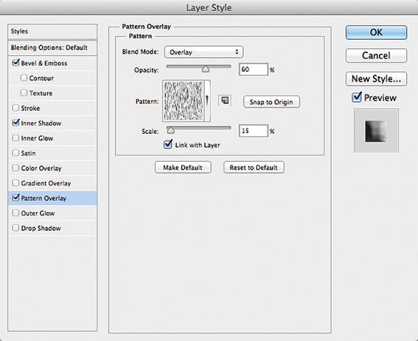
STEP SIX: Below the 3D text item in the 3D panel, you’ll see the individual materials layers (if you don’t see them, click the arrow to the left of the text item). You can highlight these and adjust the surface properties such as Shine, Reflection, and even Bump maps to add depth and realism to the 3D text. Remember that Tomb Raider text? Not so out of reach now!
The above steps should give you a really good idea of how easy it is to create 3D text in Photoshop. It took some time but designers can finally embrace 3D in a comfortable place in Photoshop. From here, you can continue to use the Properties panel to add reflections, textures, and bump maps.
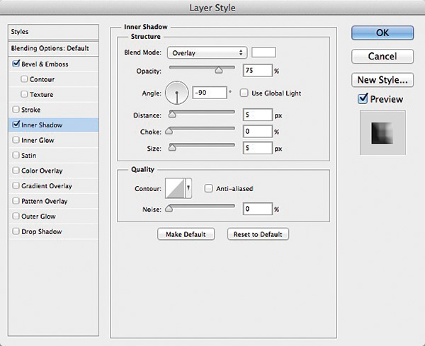
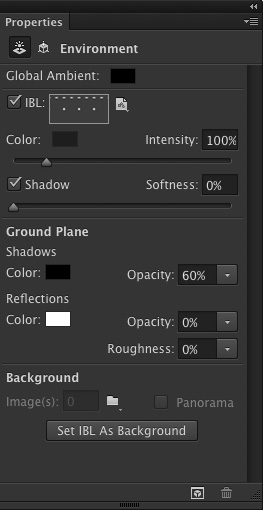
When the 3D object is initially created, it sits on an invisible ground plane, which can receive shadows and show reflections. If you click on the Environment property in the 3D panel, you’ll see settings for the Ground Plane Shadows and Reflections in the middle of the Properties panel. The Opacity for Shadows is always set to 60% by default, but if you don’t need the shadow, just drop the Opacity to 0%.
However, we also mustn’t forget that we’re in Photoshop. Before 3D, Photoshop did some amazing stuff, but now with 3D, you can achieve something extraordinary.
DISCOVER THE POSSIBILITIES
Once you have the basics down, you can start to push further and incorporate more aspects of the 3D features, which go way beyond creating 3D text. Once you’ve created some 3D text, you can break it up into individual 3D objects using the Split Extrusion feature under the 3D menu. You can now manipulate each letter separately to create a different look, as in this example based on the movie The Lorax. I was able to light and position the 3D text as one word over the ground plane so that it would cast a shadow. Then, I split the extrusion and changed the orientation of each letter. The beauty here is that it keeps all the letters in a single 3D layer; the downside is that the text can no longer be edited once the split is made. Double-check that spelling!

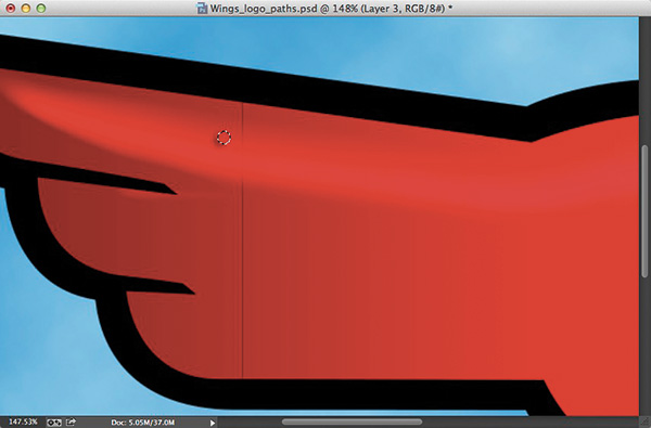
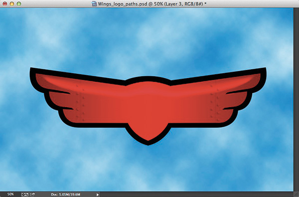
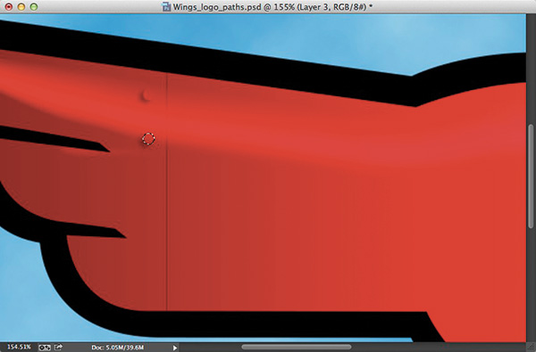
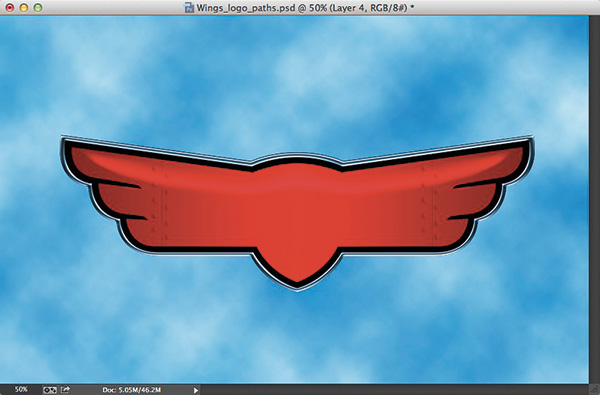
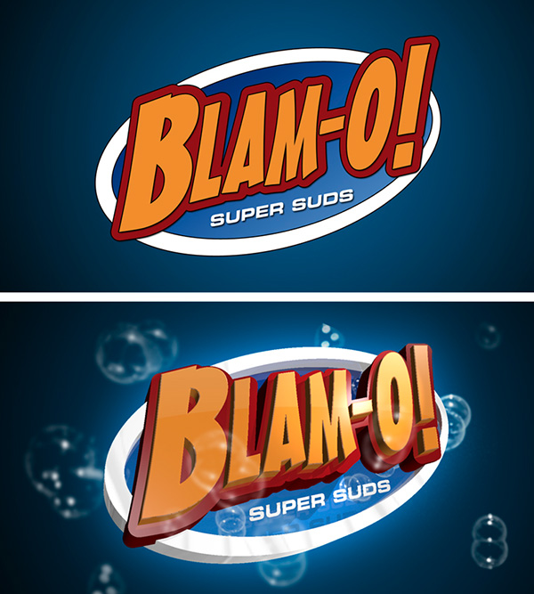
3D Logos: You can also make 3D versions of logos that started out as 2D. Here’s an example using the NAPP logo. I wanted a scratched metal look, as if it were forged in a factory, so I used a metal texture I found on Fotolia.com. I created the extruded logo using vector paths that I imported into Photoshop, then used the Properties panel to add the metal texture to the surface.
I also wanted the text to look like it was protruding from the wall, so I used the same texture and converted it into a 3D postcard (3D>New Mesh from Layer>Postcard). Now I had two separate 3D layers but I wanted these two objects to interact with each other, so I needed to merge them. You can merge 3D layers the same way you merge regular layers; the only difference is that the 3D objects can still be manipulated separately. Once the objects were merged, I added lighting coming from above, as well as from below to enhance the glow of the heat.
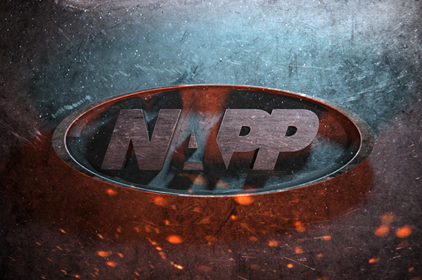
—CREDIT: TEXTURED BACKGROUND: ISTOCKPHOTO, 3DMASTER, IMAGE #13405695
Shiny Metal: You can also create realistic shiny metal text by using a simple little feature called Image Based Lights (IBL), which uses an image as a light filter. This example, which is based on the recent movie Oz: The Great and Powerful, was created by simply converting a text layer into 3D, setting the Reflection properties, and then adding the background image as an Image Based Light with a gold color cast. The rendered result is a distorted reflection of the background image along the surface of the shiny object, just as you would expect to see in real life. Sometimes 3D isn’t always about getting 3D objects to look good but also 3D effects.
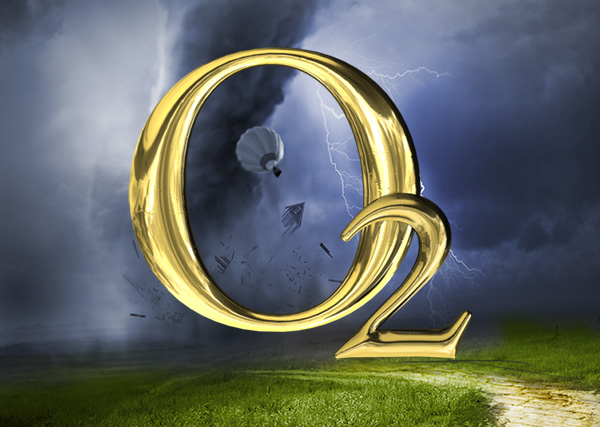
—CREDIT: BACKGROUND ELEMENTS: FOTOLIA
Photorealism: Another example of 3D text in Photoshop is adding it to a photo and using textures and matching the light in the scene to make it look as if the text is actually there. This 3D text was created in Photoshop and then added to a simple photo of a brick wall. I used the existing lighting in the photo as a guide for the placement of the lights on the text. I rotated the text in relation to the ground plane so the text would appear to be casting a shadow on the wall. I then added the light bulbs as a new 3D object and then added an illuminated glow using the Properties panel. This shows that lighting and shadows alone can help you place 3D elements into 2D images quite convincingly.

—CREDIT: BRICK WALL: FOTOLIA, PRESHPAINT, IMAGE #43209893
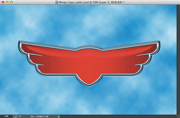
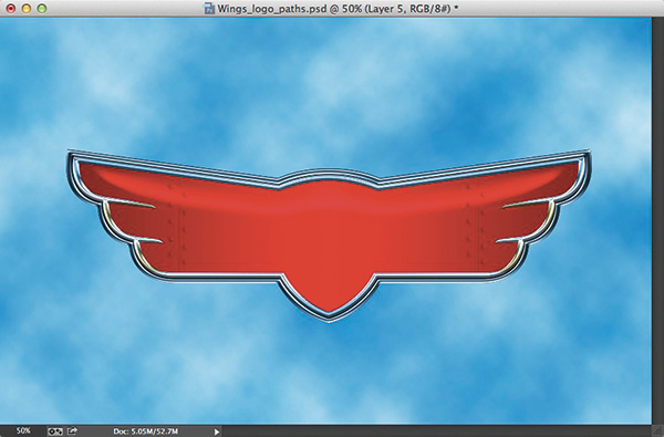
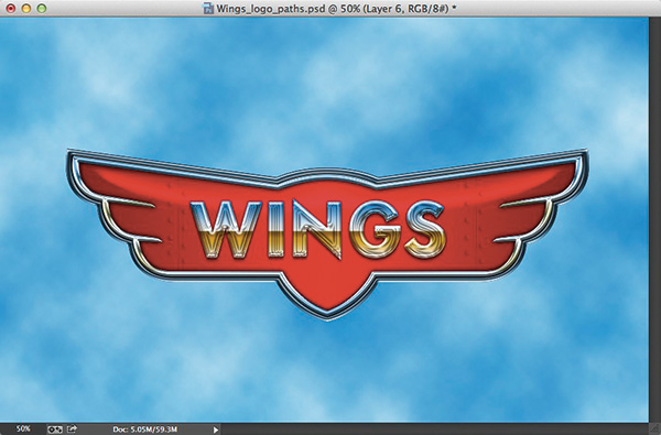
Once you’ve played around with every aspect of 3D to really see what it can do—like combining 3D objects, surface textures and reflections, extruding and manipulating 3D objects, and lighting and camera features—you can really push the envelope and achieve something that no one has ever seen come out of Photoshop. For example, this logo for this past year’s Photoshop World was created and rendered entirely using the 3D features in Photoshop CS6.
![]()
—CREDIT: LOGO: FELIX NELSON; 3D ART: COREY BARKER
This piece really encapsulates everything we’ve been talking about. It shows how far you can go with realism and depth. Just think, a few years ago something like this was only possible in high-end 3D applications, but now designers can enjoy the benefits of 3D without the steep learning curve of a dedicated 3D app.
Just knowing something is possible is only the beginning; where you take it from here is up to you. Who knows what the future holds with CC and beyond, but I’m really looking forward to the journey ahead.
This article is courtesy of Photoshop User magazine, the official publication of KelbyOne, which provides quality online education for creative people. For more information, visit KelbyOne.com.
ALL ILLUSTRATIONS BY COREY BARKER EXCEPT WHERE NOTED