Planet Photoshop
Lenovo ThinkStation E32 SFF
 Affordable, Small Form Factor Workstation
It’s not often that I get a chance to review a small form factor workstation, because I’m usually running mega-machines through their paces. Indeed, I was amazed when I got the box and could actually carry it without fear of a visit to the chiropractor to straighten out my back—again.
Needless to say, the Lenovo ThinkStation E32 SFF with its small form factor was easy to place on my desktop, but I did have some concerns that it wouldn’t be the professional workstation I’d hoped for. Well, it didn’t take long to make me a believer! While the E32 won’t compete with the mega-machines for animation or video, it’s more than adequate for your day-to-day Adobe Photoshop, Lightroom, and graphic or Web design tasks. The upside is that the ThinkStation E32 saves a ton of space and doesn’t turn your office into a sauna, as larger workstations do.
But that’s not what makes this machine special: Its specs are unheard of for this class of computer. The model we tested was loaded with the standard Intel Xeon E3 (3.40-GHz) processor and optional 8 GB of memory (4 GB is standard), which makes this a very fast machine right out of the box. Pair that up with the optional NVIDIA Quadro K600 graphics card and a 1 TB hard drive, and you have a potent combination that will have you blasting through your projects in no time.
Another great feature is that this combination is ISV (independent software vendor) certified for programs such as AutoCAD that, in turn, gives it all the power you need for the Creative Suite/Cloud programs. In addition, the E32 provides more functionality with four USB 2s, four USB 3s, and a display port—a ton of ports for your peripherals.
To put the Lenovo ThinkStation E32 through its paces, I used it to import a recent shoot of approximately 700 photos into Adobe Lightroom. The import was quick and effortless, with about the same speed as my workhorse machine. That alone was impressive. In Photoshop, I was able to maneuver easily through files that had more than 70 layers, as well as video. I won’t bore you with the numbers, but the benchmarks rival that of machines that cost twice the price of the E32. Basically, I was able to work without hesitation, and this small form factor was more bang for the buck than I expected.
And that brings us to one of the best features of the Lenovo ThinkStation E32: the price! At around $1,100 for the workstation I tested, it’s a bargain. If you’re in the market for a powerful, small form factor machine, this is the one for you. Heck, even if your work doesn’t include intense projects, and you’re looking for a new machine, this may be a perfect solution for you, so check it out.
Once again, there’s not enough space in one page to really explore the possibilities of the E32, but you definitely owe it to yourself to check it out, as it’s more than worth the price.
Company: Lenovo
Price: From $809 ($1,149 as tested)
Web: http://lenovo.com
Rating: 5
Hot: Price; small form factor; Xeon and optional NVIDIA power
Not:
Nomad Mini 2
 Paintbrush Stylus for Touchscreens
I love drawing on my iPad, but have a love-hate relationship with various styli on the market. Some have been great, others so-so, or even terrible, so when I found out that Nomad had a new brush stylus, I jumped at the chance to test it out.
Right off the bat, I liked the quality look and build of the small, retractable brush and smaller-than-normal rubber stylus of the Nomad Mini 2. It was great not to worry about the brush getting messed up when I’d throw it in my pocket and then, with a simple twist, I’m ready to paint. The Mini 2 is designed so that it’s bigger and heavier on the brush side, making it more comfortable to hold than the rubber-tip side, which felt top-heavy.
How did this stylus work when tested? I like the idea of a smaller rubber tip so that you can see more precisely where you’re drawing; however, the tip lost its effectiveness when held past a certain angle. In fact, I had to concentrate on keeping the stylus at a more straight-up-and-down angle to ensure that it would register my stroke. The tactile quality of the tip was very good, and it didn’t skip or drag.
The Nomad Mini 2 brush handled well and, because of its smaller diameter, it was easier to see where you were painting. I enjoyed using this side of the Nomad quite a bit, with one caveat: When I made a quick brush stroke, it would only begin to make a mark a little after I started drawing—not a huge deal, but frustrating when trying to be really precise. Overall, I’d say that the Nomad Mini 2 is an okay device.
Company: Nomad Brush
Price: $35
Web: www.nomadbrush.com
Rating: 3
Hot: Creative option for the tablet artist
Not: Tilt angle; weight distribution a bit clunky
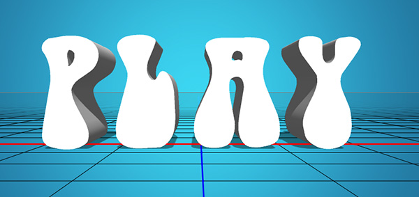
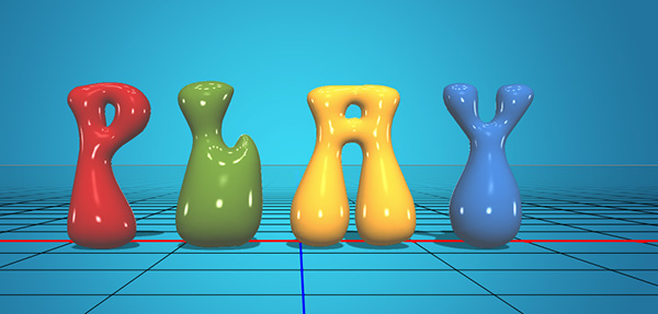
Inflated Text Using 3D in Photoshop CC
Let’s have a little fun with 3D. C’mon, just try it! In this exercise, we’ll create some inflated text using the 3D features in Photoshop. With the enhanced surface properties, you can create a reflective metallic look in a matter of minutes. (Note: For this technique, you’ll need either Photoshop CS6 Extended or CC.)
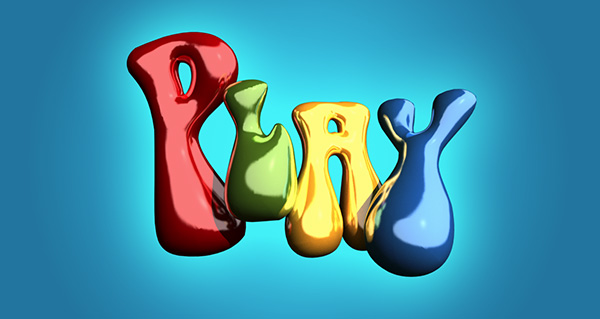
STEP ONE: KelbyOne members can start by opening the download file used in this tutorial at http://kelbyone.com/magazine/issue/october-2013/. [All download files are for personal use only. To learn more about KelbyOne, visit http://kelbyone.com.] If you’re not a KelbyOne member, you can simply create a new document and follow along with your own text. Either way, you need to use a font that has rounded edges and corners. This will help add to the rounded shapes of the finished 3D text. We used a font called Bell Bottom and typed the word “PLAY.” Since this is a specialized font, it’s not likely that many of you have it, so the download file contains the text as a shape layer.

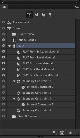
STEP TWO: Let’s convert the text into a 3D object. With the text layer or the shape layer active in the Layers panel, go to 3D>New 3D Extrusion from Selected Layer. This will immediately extrude the text and make the wire mesh ground plane visible. (If you don’t see the ground plane, switch to the Move tool [V], then choose View>Show>3D Ground Plane.)
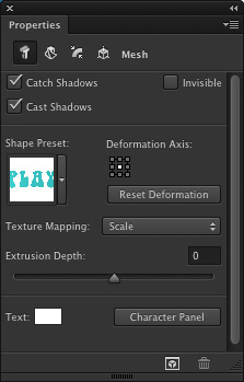
STEP THREE: In the 3D panel (Window>3D), locate the 3D text item in the list and click on it (PLAY in this example). Then, open the Properties panel (Window>Properties) and adjust the Extrusion Depth to 0. We don’t need the sides, just the front and back face.
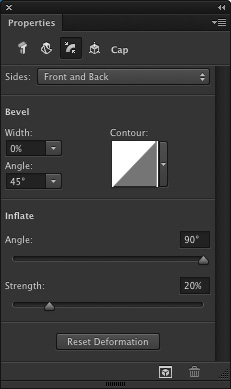
STEP FOUR: At the top of the Properties panel, click on the Cap icon, which is the third icon from the left. This is where you can modify the bevel and inflation settings. First, click on the drop-down menu at the top and set the Sides to Front and Back. Then, go down to the Inflate section and set the Angle to 90° and increase the Strength to about 20%. This will give that inflated look we’re after.
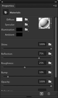
STEP FIVE: Before we split up the letters, let’s set up the surface properties for the text elements. In the 3D panel, highlight the Front Inflation Material for the text. In the Properties panel, you’ll see the various surface features. Click on the ball icon near the top right to open the Material Picker, and select the No Texture material. Click on the color swatch next to Diffuse, select white in the Color Picker, and click OK. Set the Shine to 100%, the Reflection to 75%, and the Roughness to around 25%. Apply these same settings to the Back Inflation Material, as well.
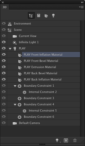
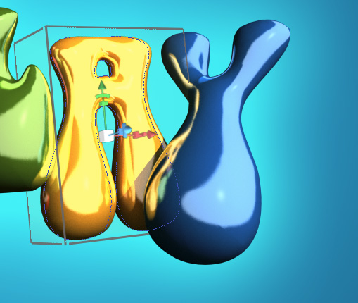
STEP SIX: Go to 3D>Split Extrusion. This will allow you to manipulate each letter individually while keeping all the letters in the same 3D layer. Switch to the Move tool (V), and click on the first letter to put a 3D box around just that letter. You can now use the 3D tools and widgets to change the position and scale this letter in relation to the other letters.

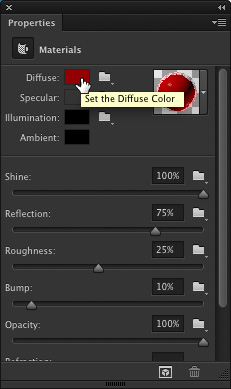
STEP SEVEN: Let’s give each letter a different color. Starting with that first selected letter, click on its Front Inflation Material in the 3D panel. At the top of the Properties panel, click on the color swatch next to Diffuse and choose a red color in the Color Picker. Click OK when done. Do the same thing for each of the remaining letters, giving each one a different color. You’ll notice that the reflection properties all stay the same even when the color changes.
STEP EIGHT: If you’re using Photoshop CC, you’ll see some specular dots on the text. These are being created by the default Image Based Light that has been applied to the text (the IBL is solid black in Photoshop CS6). It simulates reflecting the environment the 3D object is sitting in. In this case, it looks like ceiling lights reflected on the surface, but I want to use something different.

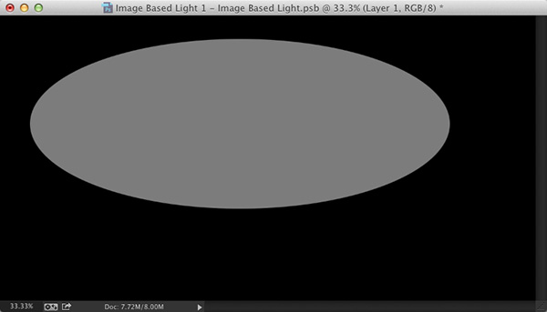
STEP NINE: In the 3D panel, click on Environment at the very top of the list. At the top of the Properties panel, just under Global Ambient, you’ll see the IBL (Image Based Light). Click on the icon to the right of the preview thumbnail and choose New Texture. In the New dialog, look for the name of your 3D file in the Preset drop-down menu to use the same dimensions as the main file for this new file, make sure Background Contents is set to White, and click OK.


STEP TEN: Once the new file is created, go back to the IBL menu and choose Edit Texture. Once the file opens, press Command-I (PC: Ctrl-I) to invert the white background to black. Then, click the Create a New Layer icon at the bottom of the Layers panel, and use the Elliptical Marquee tool (nested under the Rectangular Marquee tool [M] in the Toolbox) to create a large oval selection inside the canvas. Press Shift-Delete (PC: Shift-Backspace), choose 50% gray from the Use drop-down menu in the Fill dialog, and click OK. Close and save the Image Based Light file.

STEP ELEVEN: This will change the appearance of the light and reflected elements on the text. With the Environment property still selected in the 3D panel, you can use the 3D tools to move and rotate the IBL to change the way it appears on the text. You’re essentially moving the reflection around the surface of the object. To access the 3D tools, activate the Move tool, and you’ll see all the 3D tools at the end of the settings in the Options Bar.

STEP TWELVE: Once that’s done, you can reposition and scale each letter using the 3D tools or widgets. The letters will interact with each other by reflecting not just the Image Based Light but also each other once the 3D object is rendered (3D>Render). Remember, even though you can manipulate each letter individually, they all still remain on a single 3D layer.
This article is courtesy of Photoshop User magazine, the official publication of KelbyOne, which provides quality online education for creative people. For more information, visit KelbyOne.com.
Adding Motion Using Motion Blur and Radial Blur in Photoshop CC
The blur filters in Photoshop are just the ticket for simulating movement in a photo. Not only does this increase visual interest, but it’s also a useful effect for stock photographers. By using smart filters, your original remains unharmed and you get an automatic mask that you can use to hide the motion from parts of your photo.
STEP ONE:
To get your subject moving, open an image and activate the pertinent layer(s). If your document consists of multiple layers, click to activate one of the layers and then Shift-click another layer to activate all the layers in between, or Command-click (PC: Ctrl-click) to activate noncontiguous layers. Next, choose Filter>Convert for Smart Filters.

When you do, Photoshop tells you it’s about to create a smart object from the active layers, which you can think of as a protective wrapper; that way, the filter happens to the wrapper instead of the image (click OK to close the dialog). If at any point you need to edit the original layer(s), double-click the smart object’s layer thumbnail and Photoshop opens the original layers in a temporary document. When you’re finished making changes, save the temporary document by pressing Command-S (PC: Ctrl-S), close it, and your changes are updated in the original document.
STEP TWO:
Trot back up to the Filter menu and choose Blur>Motion Blur. In the resulting dialog, adjust the Angle setting to make the blur go in the direction you want. For example, to create a perfectly vertical blur, set the angle to 90°. To adjust the strength of the blur, drag the Distance slider right for more blurring or left for less (a setting of 100 Pixels was used here). Click OK when you’re finished.

STEP THREE:
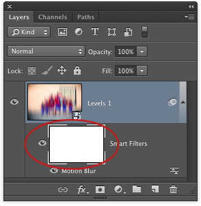
To hide the motion from parts of your photo, such as our super family’s heads, mouse over to your Layers panel and click to activate the Smart Filters mask, the large white thumbnail beneath the smart object. Once it’s active, the mask thumbnail will have tiny white brackets around it.
STEP FOUR:
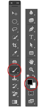
To hide the blur, you need to paint with black inside the mask, so press D to set the color swatches at the bottom of your Toolbox to the default of black and white, respectively, and then press X until black hops on top. A helpful way to remember what color to paint with inside a mask is the rhyme, “black conceals and white reveals.”
STEP FIVE:
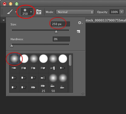
Press B to grab the Brush tool, and from the Brush Preset Picker near the far left of the Options Bar, choose a soft-edged brush. Set the size to about 250 px. Tip: You can press the Left Bracket key ([) to decrease brush size, or the Right Bracket key (]) to increase brush size.
STEP SIX:
Mouse over to your image and paint in a gentle arc across the super family’s heads. If you reveal too much of the original image, press X to swap color swatches so white is on top, and then repaint that area to reveal the blur.

STEP SEVEN:
Choose File>Save As and pick Photoshop from the Format drop-down menu to save a master copy of your document. To edit the blur amount later on, simply open the document and double-click the filter’s name in your Layers panel to reopen that filter’s dialog. Here are the before and after images and the Layers panel.

RADIAL BLUR
Another useful technique, especially for stock photography (much more so than the Motion Blur filter), is to use the Radial Blur filter to create a zoom effect. Here are two examples downloaded from iStockphoto.com (both have been downloaded well more than a thousand times).
CREDIT(top image): ISTOCKPHOTO, RANPLETT, IMAGE #405800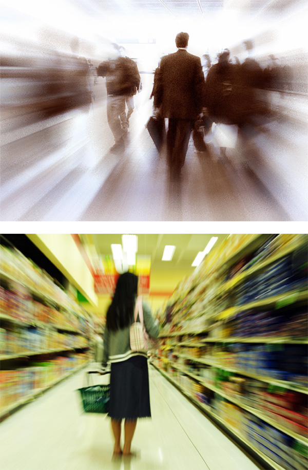
CREDIT(bottom image): ISTOCKPHOTO, AREKMALANG, IMAGE #2483218
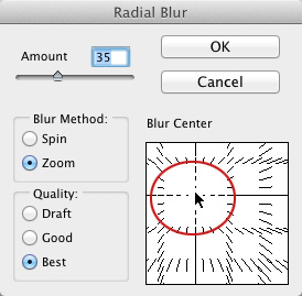
To create this effect, follow the steps above, though choose Radial Blur in Step Two instead of Motion Blur. In the resulting dialog, set the Amount to 35, the Blur Method to Zoom, and Quality to Best. Click-and-drag in the filter’s preview area to reposition the blur center (the point at which the zoom emanates). In this image, that’s the boy’s head. If you don’t get the positioning right the first time, double-click the Radial Blur filter in your Layers panel to reopen the filter’s dialog.
Use the Smart Filters mask to hide the blur from the little boy’s head as described above.
CREDIT: ISTOCKPHOTO, IMGORTHAND, IMAGE #20242004
As you can see, adding motion to the right image can make a big impact. Not only does this give photographers another product to sell, either to their own clients or as a stock shot, but it also helps designers capture attention in ads.
This article is courtesy of Photoshop User magazine, the official publication of KelbyOne, which provides quality online education for creative people. For more information, visit KelbyOne.com.
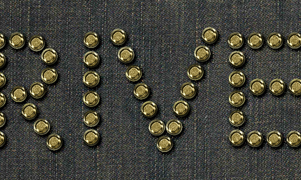
Metallic Rivets on Denim Text Effect
This tutorial will show you how to use Photoshop’s Layer Styles and a simple Brush to create a metallic rivets – inspired text on a denim background.
Tutorial Assets
1- ETH font (ETH Sans/EthRomainEthon.ttf).
2- FabricPlain0067 (Small 1024×625 ) texture.
Loading the Contours
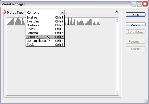
You might need to load the Contours used in some of the Layer Styles below. To do so, go to Edit -> Preset Manager, and choose Contours from the Preset Type drop down menu.
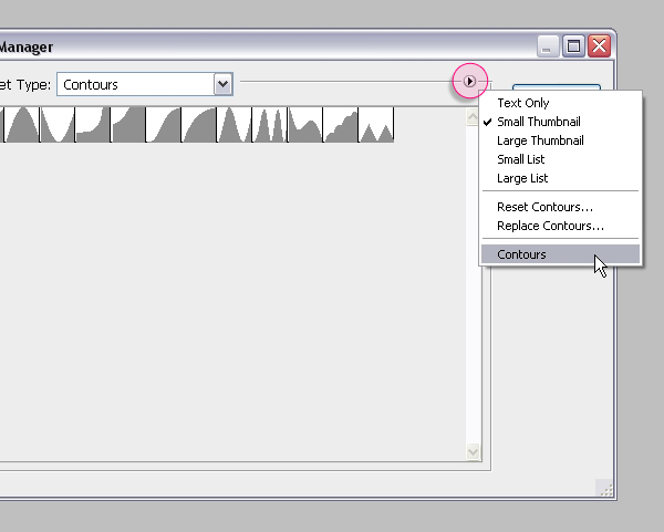
Click the small arrow in the top right corner, and choose Contours.
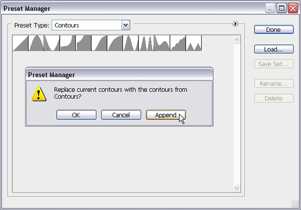
Click Append to add the new contours to the existing ones.
Step 1
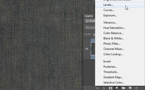
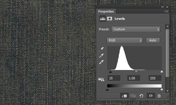
Open the “FabricPlain0067″ image, then click the “Create new fill or adjustment layer” icon down the Layers panel and choose Levels.
Change the Shadows value to 15 to darken up the texture a little bit. You can change this value any time later if needed as well.
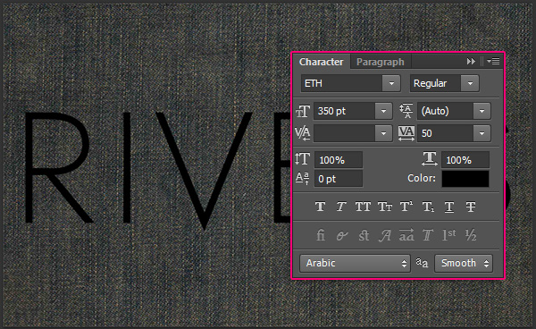
Create the text using the ETH font, or any other font you’d like to use as a reference. The Size is 350 pt, and the Tracking value is 50.
Step 2
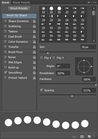
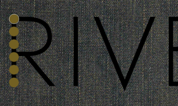
Pick the Brush Tool and open the Brush panel (Window > Brush). Choose a hard round 30 px brush tip and change its Spacing value to 131.
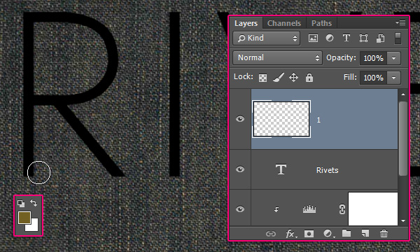
Create a new layer on top of the text layer and call it “1″. Set the Foreground color to #726023, then start adding the rivets on top of the text you have.
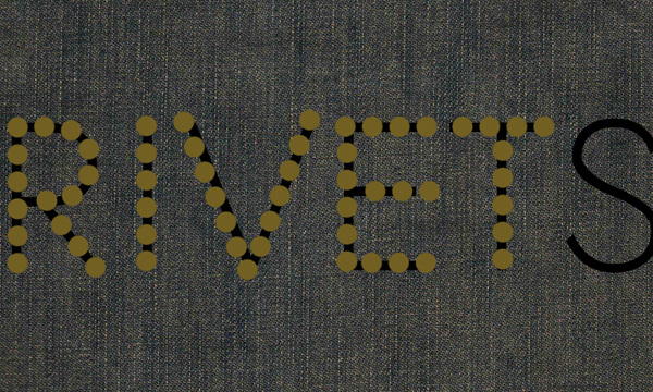
For the simple letters, you can either:
1- Click and press and hold the Shift key, then drag to create straight lines. Or,
2- Click once where you want the line to start, press and hold the Shift key, then click again where you want the line to end.
– Stroke
You don’t have to follow the exact shape of the letters. Feel free to make your own adjustments as you’re creating the rivets.
Step 3
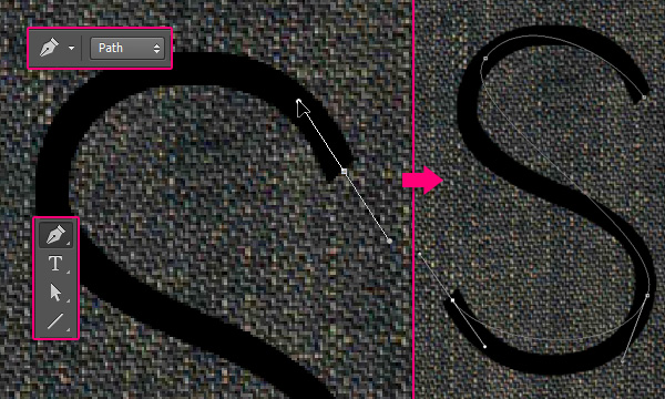
For the more complex/curved letters, you can use the Pen Tool, with the Path option selected in the Options bar to create a work path that you can stroke with the brush.
You can click once to create sharp points, or click and drag to create curves. Just map out the basic shape of the letter, and then you can modify it as shown next.
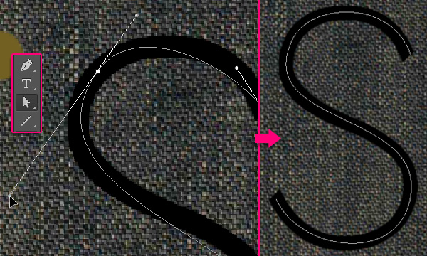
Pick the Direct Selection Tool to modify the path. You can click and drag an anchor point to move it around, or you can click the Direction Points at the end of the two Direction Handles, then move them around to change the orientation of the curve, or drag them outwards and inwards to make the curve wider or narrower.
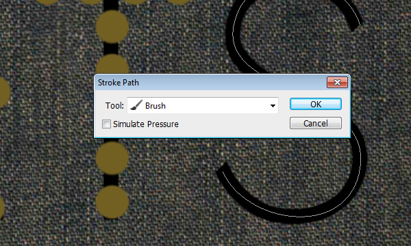
Once you’re done, right click the path and choose Stroke Path.
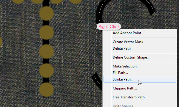
Choose Brush from the Tool drop down menu and click Ok, then hit the Enter/Return key to get rid of the work path.
Once you’ve added the rivets to all the letters, make the original text layer invisible by clicking the eye icon next to it.
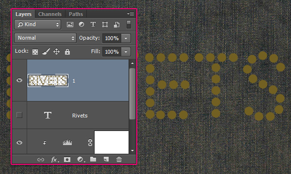
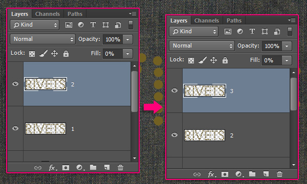
Duplicate the layer “1″, rename the copy to “2″, then change its Fill value to 0. Duplicate the layer “2″ and rename the copy to “3″.
Step 4
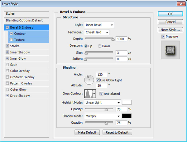
Double click layer “1″ to apply the following Layer Style:
– Bevel and Emboss
Technique : Chisel Hard
Depth : 1000
Size : 3
Gloss Contour : Ring
Check the Anti-aliased box
Highlight Mode : Linear Light
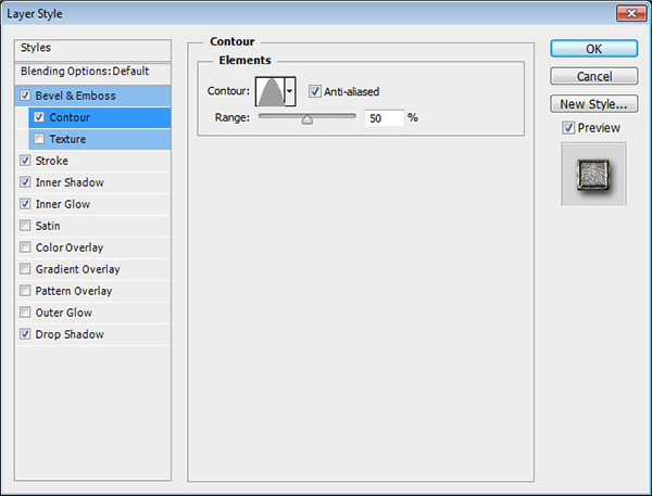
– Contour
Contour : Cone
Check the Anti-aliased box.
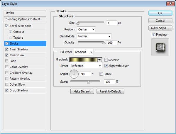
– Stroke
Size : 1
Position : Center
Fill Type : Gradient
Style : Reflected
Angle : 90
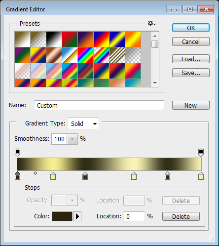
Click the Gradient box to create the gradient
To create the Gradient, you’ll need to click below the gradient bar to add Color Stops, then assign the Color and Location value for each one. Here are the values used from left to right:
Color – Location
#2c2410 – 0
#f6ee91 – 19
#2f2d13 – 37
#f9f3c3 – 63
#302e17 – 82
#faf2b2 – 100
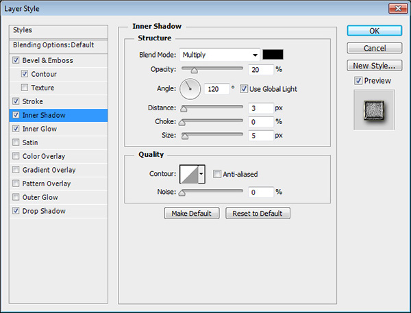
– Inner Shadow
Opacity :20 %
Distance : 3
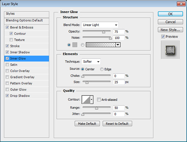
– Inner Glow
Blend Mode : Linear Light
Noise : 100%
Color : #b6b6b6
Source : Center
Size : 25
– Drop Shadow
Blend Mode : Linear Burn
Size : 9
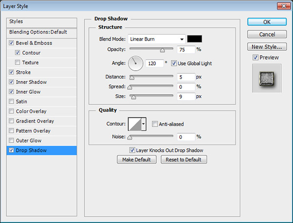
This will create the first layer of the rivets.
Step 5
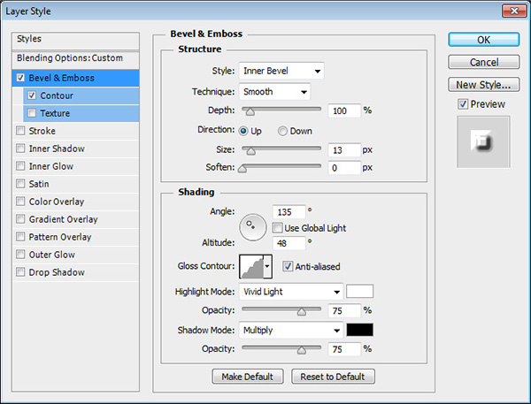
Double click layer “2″ to apply the following Layer Style:
– Bevel and Emboss
Size : 13
Uncheck the Use Global Light box
Angle : 135
Altitude : 48
Gloss Contour : Rounded Steps
Check the Anti-aliased box
Highlight Mode : Vivid Light
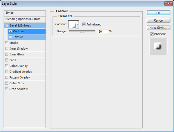
– Contour
Contour : Log
Check the Anti-aliased box.
This will style the second layer.

Step 6
Double click layer “3″ to apply the following Layer Style:
– Bevel and Emboss
Technique : Chisel Hard
Gloss Contour : Ring – Triple
Check the Anti-aliased box
Highlight Mode : Overlay
Opacity : 100%
Shadow Mode – Opacity : 0%

– Contour
Contour : Ring
Check the Anti-aliased box.
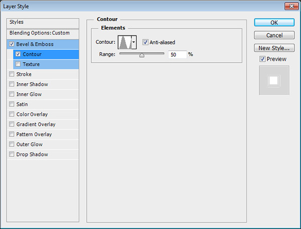
This will style the final layer of the rivets.
Step 7
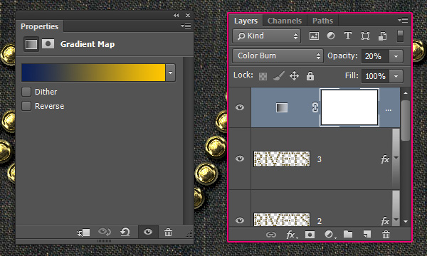
Click the “Create new fill or adjustment layer” icon down the Layers panel and choose Gradient Map.
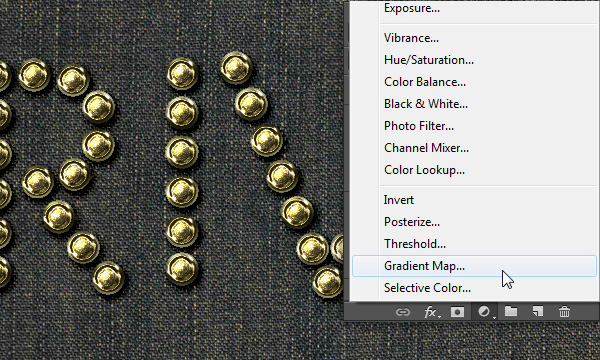
Create the Gradient using the colors #0a1e59 to the left and #ffc600 to the right. Then, change the Adjustment Layer’s Blend Mode to Color Burn and its Opacity to 20%.
Step 8
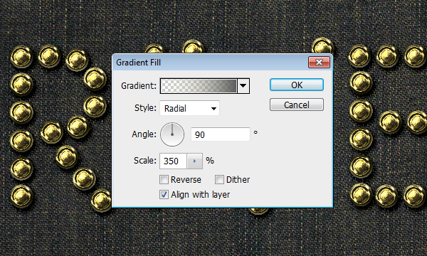
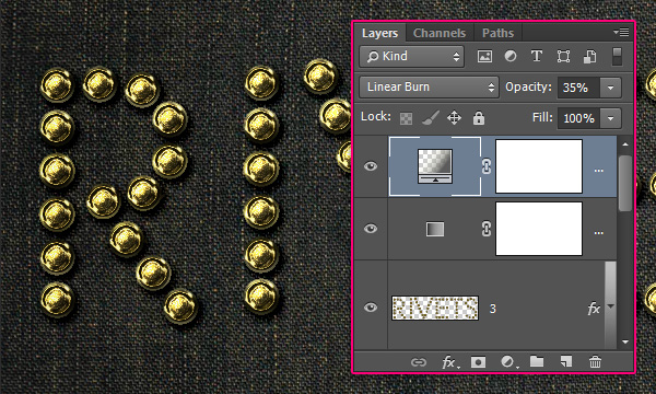
Click the “Create new fill or adjustment layer” icon down the Layers panel and choose Gradient.
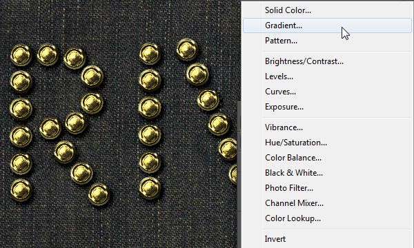
Choose a transparent to fill color gradient, with the colors #dfdbba to the left and #5b5b5b to the right. Change the Style to Radial, the Angle to 90, and the Scale to 350.
Change the Gradient layer’s Blend Mode to Linear Burn and its Opacity to 35%. This will darken up the final result, and add some nice vignette.
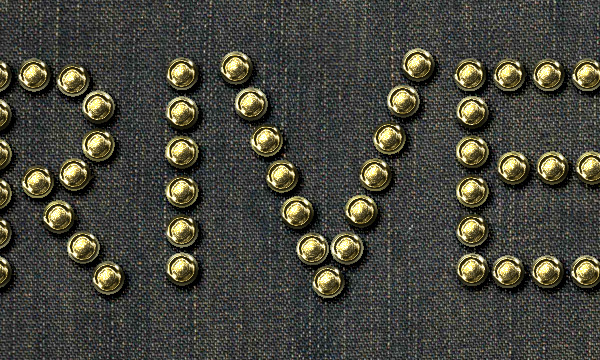
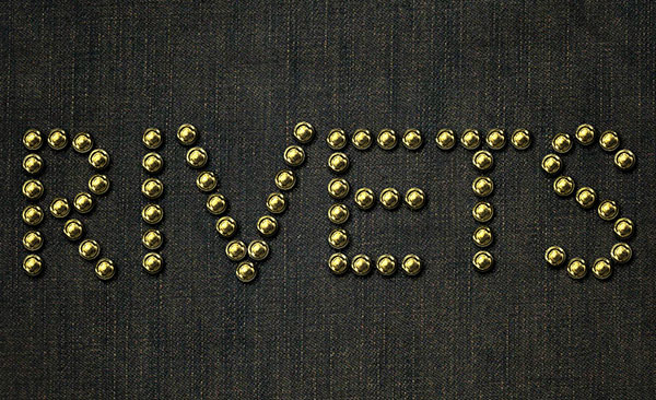
Conclusion
This is the final result. A really simple way to stroke a path and use Layer Styles to make it look more interesting.
Hope you enjoyed the tutorial and found it helpful.


0 comments:
Post a Comment